


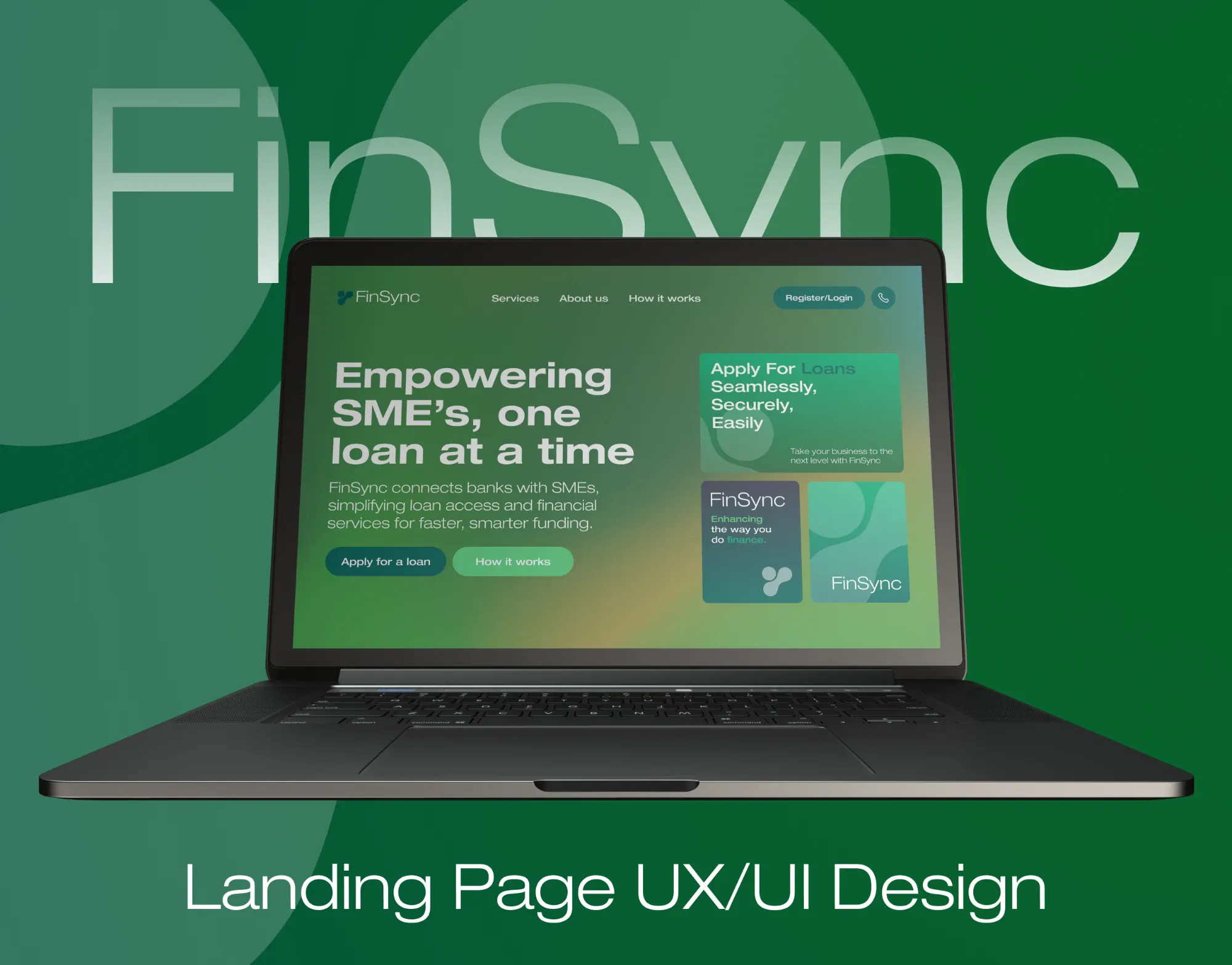
FinSync
Landing page · Fintech · 2025
- UX research
- UI design
Case study soon

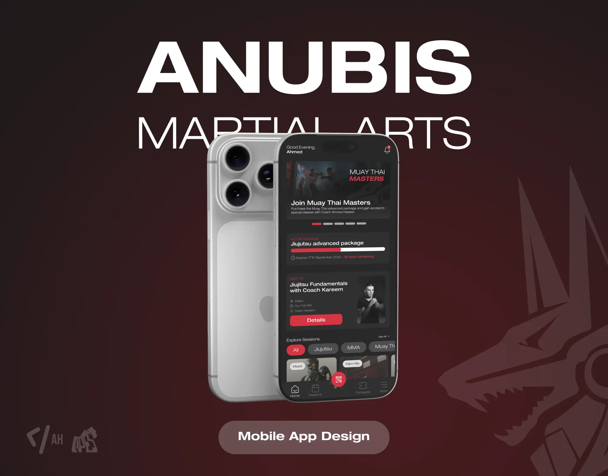
Mobile app · Martial arts · 2025
Class packages, sessions, coaches and QR check-in for Anubis Martial Arts across its branches.
 Anubis Martial Arts, Egypt
Overview
Members train hard and want to see it: what they've attended, what's left on their package and which class is next. Anubis needed one app that shows them, and takes the admin off the front desk.
01Research
Anubis Martial Arts Academy trains Brazilian Jiu-Jitsu, submission grappling, MMA and Muay Thai in Egypt. Its head coach, Mohamed Omar, holds his black belt under world champion Roberto "Cyborg" Abreu and helped build the country's BJJ scene.
Behind the mats, attendance, packages, private coaching requests and merch all ran by hand or across scattered chats, so members couldn't see where they stood and the academy did the same work twice. I benchmarked five fitness and gym apps for what they get right and what they miss, then mapped the member's journey and the flows that matter most: booking, checking in and tracking progress.
One structured run from the first benchmark to files a developer can build from, each week ending in something the academy could see.
Every member should see their progress, not have to ask for it.
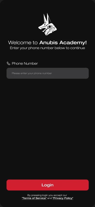
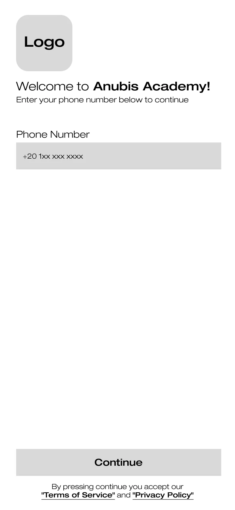
Every flow was settled in grey first: layout, hierarchy and navigation, before a single colour. Drag across the phone to see what each screen became.
02Design
The app lives in the academy's colours: near-black, with Anubis red for every action and Helvetica Neue's extended cuts giving the titles a fighter's stance. The home screen answers a member's three questions at a glance: how long is left on their package, which class is next and with which coach, and what else is on this week.
Check-in is a QR code in the middle of the tab bar, one tap from anywhere. Belts unlock as achievements, discipline by discipline, so progress shows on the mat and in the app. Merch can be browsed and asked about, but not bought: checkout was kept out on purpose, so the first release stays focused on running the academy. Every screen is built from one component library, with variants for each state.

Onboarding
Login

Home

Sessions

Calendar

Session

Packages

Package

Coach

Achievements

Merch

Profile
Six weeks after the first benchmark, the academy had a clickable prototype and dev-ready files: every screen and every state, from signing up to a suspended account.
Scope is a design decision. Leaving checkout out made the first release sharper.
Landing page · Fintech · 2025
Case study soon
Mobile app · Fintech · 2024
Case study soon
Web app · Verto Technologies · 2024
Case study soon