


Anubis
Mobile app · Martial arts · 2025
- UX research
- UI design
Mobile app · Healthcare · 2025
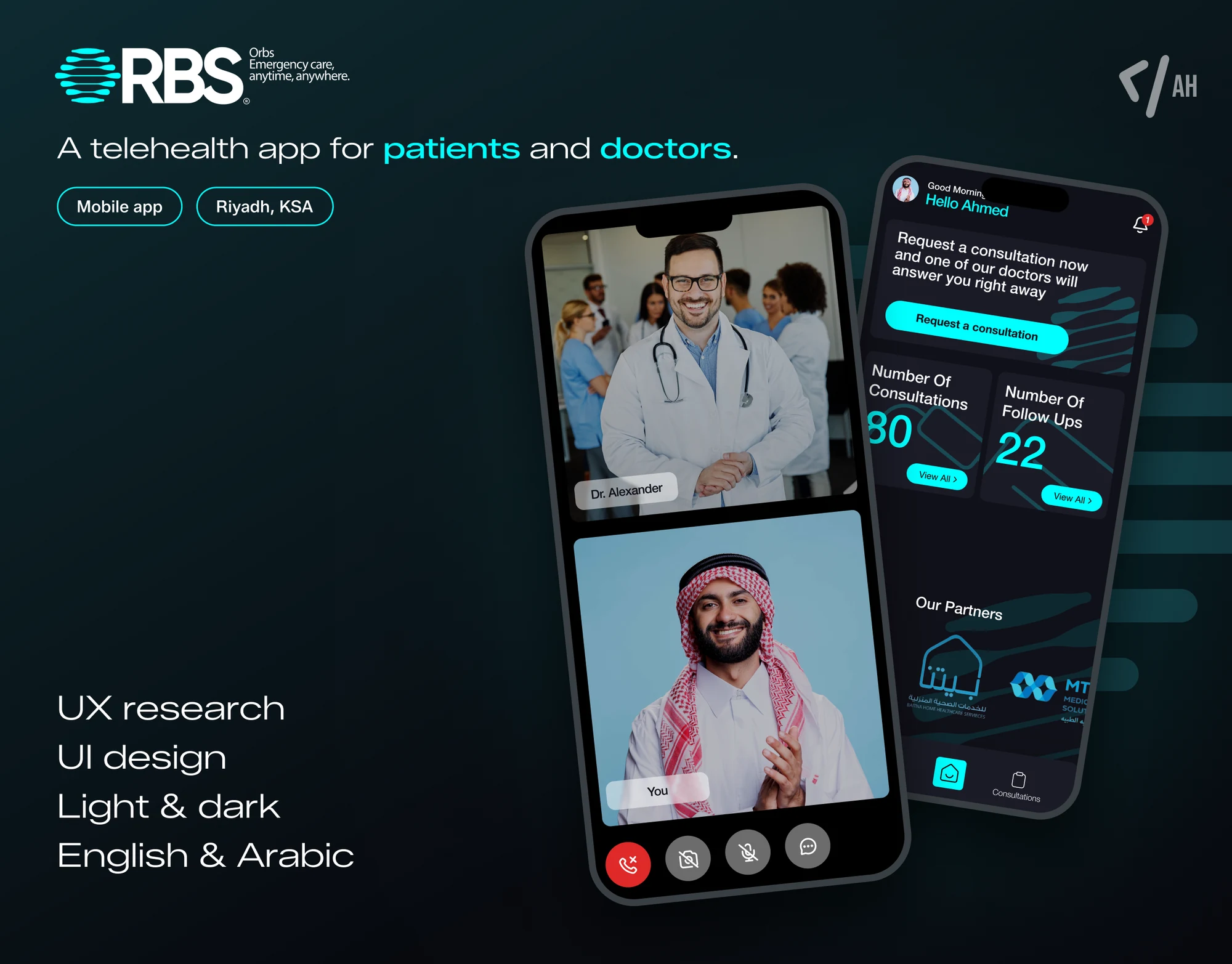
A bilingual telehealth app for ORBS in Riyadh: patients reach an emergency consultant on a video call, and doctors take, write up and follow up on every consultation.
 ORBS, Riyadh
Overview
Most emergencies need a doctor, not a hospital. ORBS puts an emergency consultant on a video call at any hour, and needed one app for both ends of that call: the worried patient, and the doctor answering.
01Research
ORBS is a Riyadh medical company, licensed by the Saudi Ministry of Health, that runs remote emergency care: adult and paediatric emergency consultants available around the clock, for everything that doesn't need a trip to hospital, from fevers and infections to infant colic and high blood pressure.
That's two people with very different jobs on one call. The patient, often a parent, needs to reach a doctor fast and know what it costs before anything happens. The doctor needs to know who they're about to see. I mapped both journeys end to end, from the splash screen to logging out. They share sign-up, verification and settings, then split: the patient requests a consultation, answers the triage questions, pays and joins the call; the doctor accepts it, reads the patient's history, writes the consultation and any follow-up.
Sources: About ORBS (opens in a new tab)
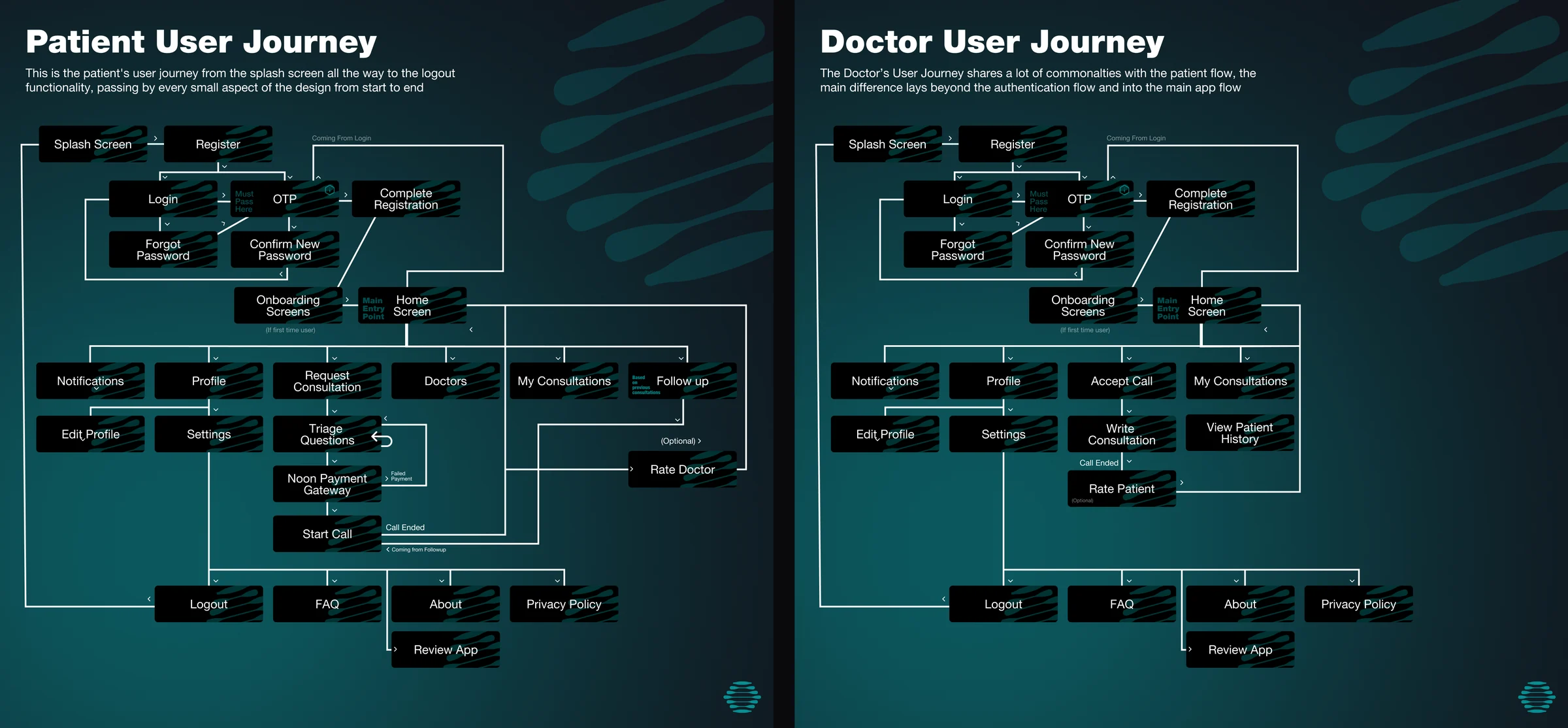
Both apps ran side by side, so every decision on the patient's side was checked against the doctor's.
In an emergency, every extra screen is a wait. The shortest way to a doctor is the product.
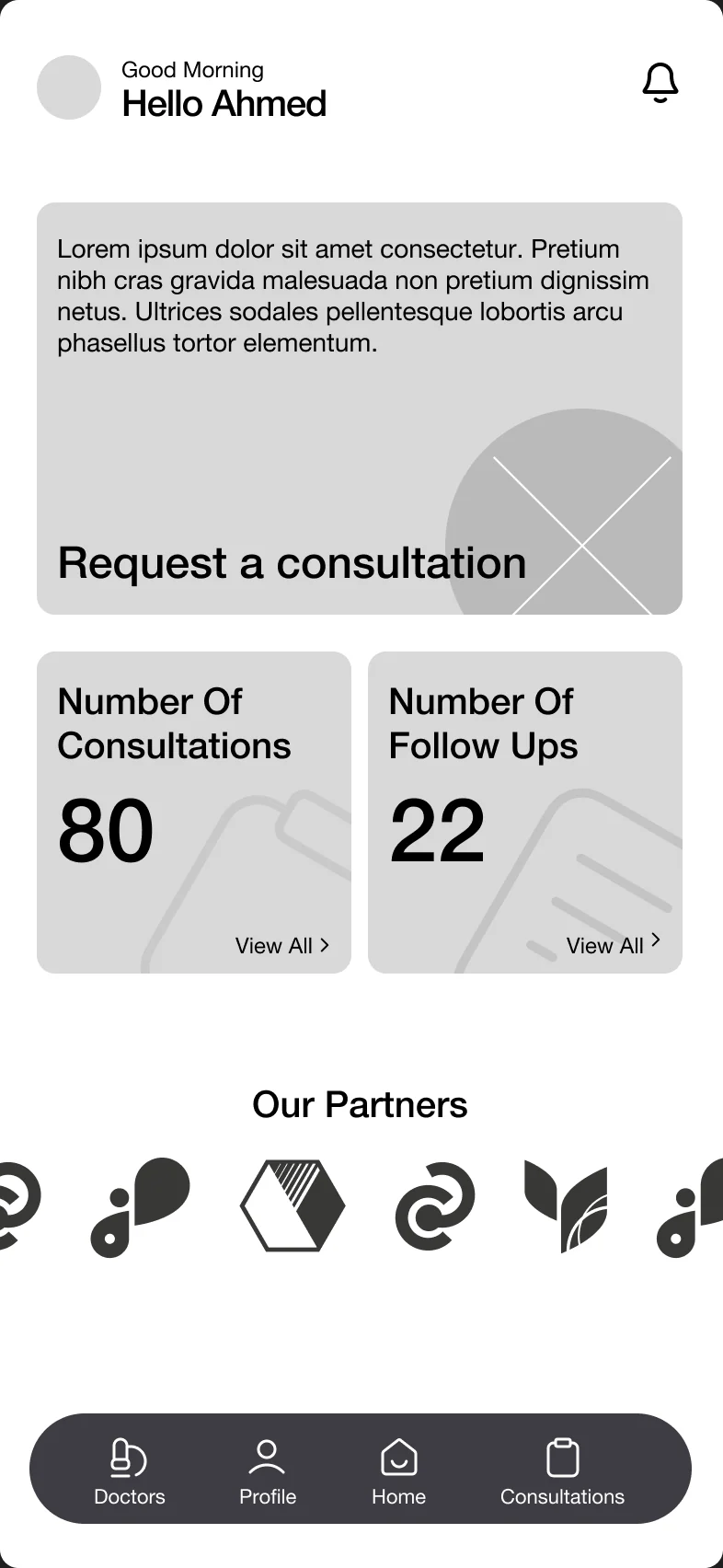
Every flow was settled in grey first, both sides of the call, before a single colour. Drag across the phone to see what each screen became.
02Design
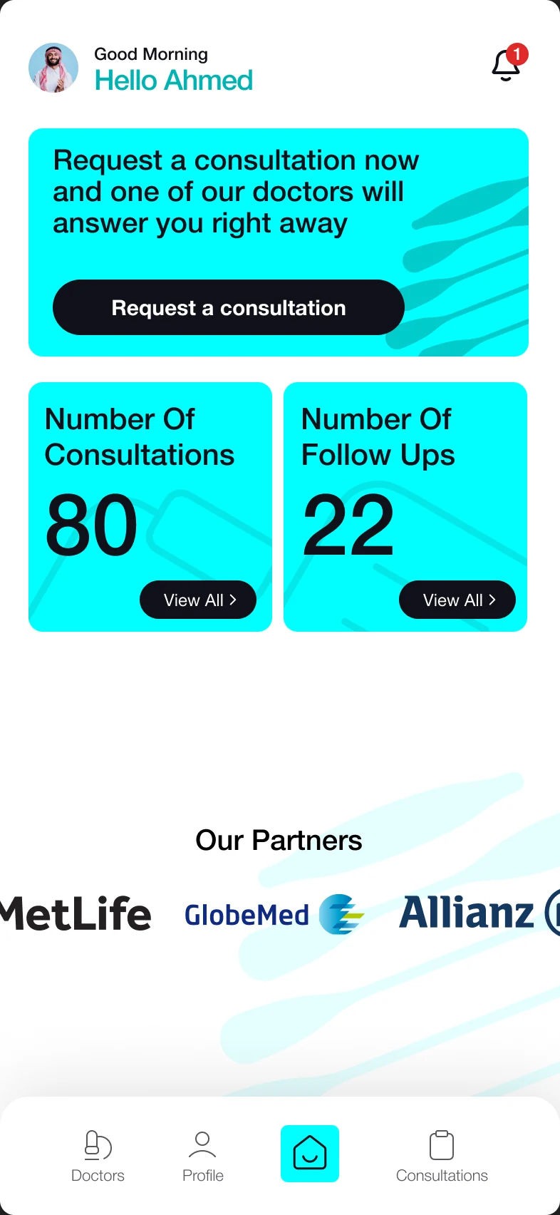
The app wears ORBS's own colours: an electric cyan for everything you can act on, against near-black, with the brand's brushstrokes moving through the cards. The home screen leads with one thing, a button to request a consultation now, with your consultations and follow-ups counted underneath.
The path to a doctor is short and honest. Triage questions come first, so the consultant knows what they're walking into before the call connects, and the price, 50 SAR, is confirmed before anything is charged through the Noon payment gateway. The call itself keeps everything under a thumb: camera, microphone, chat and hang up. Afterwards the patient rates the doctor, and every consultation, its write-up and its follow-ups stay in one history.
On the other end, the doctor's app opens on the consultations waiting to be accepted, with the patient's history one tap away and a write-up and follow-up form for when the call ends. Every screen exists four times: light and dark, English and Arabic, with the Arabic mirrored right to left rather than translated in place.

Splash

Onboarding

Home

Triage

Price

The call

Rating

Consultations

Consultation

Doctors

Doctor

Home, dark

Home, Arabic

Home, Arabic dark

Triage, dark

The call, dark

The call, Arabic

Home

Waiting

Consultations
03Design
Both sides of the call were wired into clickable prototypes, so ORBS could tap through each journey on a phone before a line of code was written. The patient's runs in Arabic, in light mode, from the splash screen through triage, payment and the call to rating the doctor. The doctor's runs in English, in dark mode, from signing in to accepting a consultation and writing it up.


04Research
The handoff came with three suggestions for what's next, each from a gap in the journeys. Categories, so doctors can list themselves under a speciality and patients can choose from each. Medical articles, to give patients a reason to open the app between emergencies and add to its credibility. And a minimal shop, so a patient can buy the medicine they were just prescribed without leaving the app.
Two months after the first journey map, ORBS had both apps designed end to end, every screen and state in light and dark, English and Arabic, ready for development.
Design both ends of the call. The patient's answers are the doctor's first read.
Mobile app · Martial arts · 2025
Landing page · Fintech · 2025
Case study soon
Mobile app · Fintech · 2024
Case study soon